Saturday, July 31, 2021

 Applications in GIS Module 4

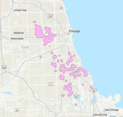
This week we learned how to produce hotspot maps using a three different methods. We used crime data from different cities to come up with different hotspot maps that either showed what areas were experiencing certain types of crime or where a certain type of crime was predicted to occur. In order to carry out the analysis we used grid based hotspot mapping, kernel density hotspot mapping and finally Local Moran's I hotspot mapping. Below are the hotspots maps that I produced along with a brief description of the processes involved in carrying out the analysis. 

This is the data that was produced from the grid based hotspot mapping process. This map represents partial homicide data within the Chicago area in 2017. Because this analysis is based on initial grids the results came out in nicely shaped polygons. This analysis required spatially joining data to attach homicide number to the grids. Once the data was joined, certain attributes were selected and the data was filtered to show only the areas with the highest homicide rates. The dissolve tool was used to clean up the data by eliminating the resulting multipart polygons. This data produced in this analysis was very close to the method which was determined to the best at predicting future homicides. This method was ranked second in effectiveness because it was slightly less precise in identifying problem areas. 

The second method we used was the kernel density hotspot mapping method. The kernel method required more steps than the grid method. The kernel analysis produces a raster with associated numerical values. After adjusting the data to better represent the data the raster was reclassified and converted to a shapfile. The resulting shapefile resulted in the largest geographic area of the three methods we used. Similarly the kernel method also resulted in the most homicides predicted. This method is likely not the preferred method as it spreads the data over a large geographic area. 

The final method we used to create hotspot maps was the Local Moran's I method. This method considers areas and occurrences to derive the final product. The methods used are similar to the kernel density method with the exception of using different more complex analysis for the Moran's method and it also required a bit more data manipulation. I believe this method to be the most precise of the methods we tried. This method and the grid method had an equal amount of homicides projected, however the Moran's method had the smallest geographic area. A smaller geographic area means the numerical data produced should be more precise or at least more relevant to a given area. The Moran's method is likely more precise because it considers more factors and takes into account surrounding areas when assembling a shape. 


Friday, July 23, 2021

Applications in GIS Module 3

This week's module had to do with Visibility Analysis. We learned and practiced different techniques from ESRI Training Courses. The courses we had to complete were:

Introduction to 3D Visualization
Performing Line of Sight Analysis
Performing Viewshed Analysis in ArcGIS Pro
Sharing 3D Content Using Scene Layer Packages

I really enjoyed the Introduction to 3D Visualization most of all. In one of the exercises we had to complete we learned how to carry out 3D extrusions. Using 3D extrusions could be very useful for making maps that contains varying surfaces making them more interesting to look at. I also enjoyed learning how to depict 3D scenes with different lighting. We practiced changing the look of a scene by adjusting the date (season) and time of day. Making small adjustments such as altering your light source really helps 3D scenes look more polished. 

The 3D Content Sharing course I am sure will be really helpful as well. Sharing 3D data is not as simple as sharing simple shapefiles or other forms of standard data. 3D data must be packaged correctly before it could be uploaded to ESRI Online and shared. 

Overall this was a really helpful module to work through.  

Saturday, July 17, 2021

 GIS Applications - Module 2

This week we are working on Module two which has to do with using LiDAR data to carry out various operations. We downloaded and prepared LiDAR data for use in ArcPro. Once the LiDAR data was ready for use we carried out several analysis to create a DEM and DSM. We also used the LiDAR data to calculate forest heights and determine the density of vegetation within a given study area. Once all the analysis were completed we created three maps which included the various products resulting from LiDAR data analysis. Below are my resulting maps. 

This first map shows the original LiDAR data over a topographic map and also a DEM that was derived from the LiDAR data. 

The second map I produced shows vegetation density within the study area. In this map it is easy to pick out the man made structure (bright yellow roads). 

The final map produced presents tree height data that was derived from LiDAR. The chart included on the document provides statistics for trees based on the data presented in the map. 


Sunday, July 11, 2021

 GIS 5100 Module 1 Least Cost Paths

The second part of Module 1 had us learn about and practice creating least cost paths and corridors. Creating least cost paths is a very involved process with many steps and complex operations to carry out. Cost surfaces need to calculated and various operations with rasters need to be done. Ranking of data used in cost surface analysis is vital to cost paths. Every part of the area being analyzed must have some cost (rank) associated with a cell in order to carry out the necessary cost analysis. A lack of data in some areas will lead to holes in the analysis. 

The map below shows a corridor between two national forest areas that is to be used by black bears. The corridor was derived by using elevation, land cover and road data/inputs. The input data was first reclassified in order to rank features and then combined. The combined data was used to create a cost surface. The cost surface was repeated with both a source and a destination in order to prepare for a corridor analysis. The corridor analysis combined the the cost surfaces and created the actual corridor with various ranked values. The least probable corridor values were removed and only the most suitable corridor area was mapped. 


The area mapped as corridor looks to be wide and still crosses lots of roads. It is likely that the weights of certain input factors need adjusting or perhaps more or different constraints need to be included in order to narrow down a corridor and make it more realistic. 


 GIS 5100 Module 1 Suitability 

For this module we have learned about and explored suitability modeling. Suitability modeling has many different uses and can be very helpful particularly when carrying out analysis related to planning. Our assignment had us create theoretical suitability maps for mountain lion habitat and we also created a suitability model that determined the amount of potentially developable land within a certain area. Both analysis used different factors as constraints. 

The map posted below contains two distinct products that show the same data but were derived using the weighted overlay tool but using different weights. Various constraints were analyzed to come up with the final developable areas. On the map document below the map on the left has equal weights assigned to all inputs that were put in the weighted overlay tool. The map on the right has varying weights assigned to the various inputs. The map on the right is likely more accurate for the stated needs as it places varying weights on input factors. A developer will likely assign weights to some factors based on their favorability for development much like we did in the map on the right. 


Saturday, July 3, 2021

Hello Everyone my name is Harry Sandoval. I am almost one year into the Masters in GIS at UWF. I work as a Natural Resource Manager for a local government agency that is primarily responsible for management and monitoring of endangered and special status species in Riverside County California. Over the last few years I have been working to create more efficient ways of carrying out land management activities and GIS has been an integral part of the projects I have been working on. I have managed to get our agency to integrate GIS into various tasks such as species monitoring and tracking, land protection and security and invasive species monitoring. As GIS analysis and tasks have become more complicated for me I figured it was time for me to go back to school and learn new techniques and practices. I hope to gain more experience in remote sensing and practical applications of GIS in relation to natural resource management. 

When I am not working or spending long nights working on assignments for school I try and spend as much time as I can with my wife and our 8 year old daughter and 1 year old son.

Below is the link to my story map which takes you on a short journey to some of my favorite camping areas mostly along the coast of California. I look forward  to the days when both are kids are old enough to take long car rides and go on epic camping adventures.   

https://storymaps.arcgis.com/stories/69fb7513c3444d4c8ebaf57d5f7c737e


GIS 6005 Communicating GIS Final I have reached the final assignment of this course. This week we had to put all the skills that we learned ...