This week I worked on the assignment for Module 5. Module 5 had to do with choropleth maps. This assignment was fun but a little challenging. The most challenging part of this assignment was getting everything to look good on the map. Colors, symbols and labels all had to work together in a very tight area. The portion of Europe just east of Italy has many small countries in close proximity to each other. Using graduated symbols posed a problem because often the symbols would be larger than the the associated country or region. The symbols on the map are graduated and represent liters of wine consumed per capita which varies greatly. Adding an inset map helped for a some areas but the map has a lot going on so I did not want to add multiple insets. Different symbols to represent wine consumption may have worked better so I am going to work on my editing skills in Adobe to come up with create symbols in the future.
Saturday, April 24, 2021
Saturday, April 17, 2021
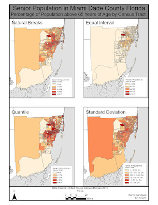
This week's Module (Module 4) dealt with statistics and how to represent statistics on a map in order for them to be accurate and easy to read and understand. The assignment involved producing two maps each map was broken down into 4 distinct maps with each represented a different type of statistical classification system. Natural breaks, equal interval, quantile and standard deviation classification systems were used for both maps. The difference in the maps was the normalization of data. The second layout normalized all classifications by the area (in square miles) of the census tract. After analyzing the results of both maps and each classification system it appears as if the quantile classification system best displays the data provided. In some cases variation within classes was very minimal or very hard to see. On my layout with normalized data I used an inset map to detail the northeastern portion of Miami Dade County. Even with the inset the data is difficult to see. The true issue is that the data does not work well with a standard deviation classification system.
Sunday, April 11, 2021
This week I worked on Module 3 for Computer Cartography. This week's assignment meant dealt with Gestalt's Principles. The main assignment was to create a map of schools within Ward 7 of Washington D.C. while incorporating Gestalt's principles. I employed visual hierarchy in my map as one of the design principles. I used the same symbol to symbolize schools, however I varied the size of the symbol so a reader could distinguish the type of school. I used small school symbols for elementary schools, medium symbols for middle schools and large symbols for high schools. A second principle I employed was figure-ground. I varied the intensity of colors while staying within the same color spectrum to call attention to certain areas. I used gray to symbolize the limits of Washington D.C. and I used a lighter gray to represent Ward 7. I also used some contrasting colors in the inset map to ensure a reader noticed that other states were simply shown for reference and had no real bearing on the data being displayed. Finally I tried to achieve balance on my map in its entirety. I used similar colors for features such as the legend and shapes containing text. I relied heavily on guides to place items on equal planes regardless of their location on the page.
Friday, April 2, 2021
Cartography Module 2
This week our assignment dealt with Typography. The objective was to make a map of Florida and label some specific cities, rivers and water features while using at least three different modifications to make the required elements stand out. I chose a mix of ordinal and nominal modifications to distinguish amongst the different features. For my first modification I varied the point symbols of the cities. I varied the size of circles I used to represent different cities. Cities that we were required to label I made used large circles for and other cities I used small circles for. For the state capital I used a large star with a different bright color in order to make it stand out. A second modification I made was varying the size and appearance of the text I used to label cities. For cities that required labeling I used a larger text and used a halo to add extra emphasis. For other cities I used a smaller text and no Halo. For the smaller cities I had to make sure label placement was in an ideal spot where a halo or callout would not be necessary. The final modification I made was to the water features. We had to label certain rivers along with swamps and marshes. I used the same font for all water features however I varied size and placement. For rivers I used a smaller font size and placed labels along river contours. For swamps and marshes I used a larger font and placed the label within the polygon feature wherever possible.
This map was a bit challenging to me as I did not exactly know what I should emphasize either water features or cities or Florida overall. I ended up compromising and trying to put an equal amount of emphasis on all features led me to the following product.
GIS 6005 Communicating GIS Final I have reached the final assignment of this course. This week we had to put all the skills that we learned ...

-
This week I worked on the assignment for Module 5. Module 5 had to do with choropleth maps. This assignment was fun but a little challengin...
-
Photo Interpretation and Remote Sensing This week in class we learned about the different factors that could interfere with Electromagnetic...
-
GIS 5050 Week 1 Lab Assignment. This weeks lab assignment was to complete a crude map of the world. Very little data went into the creati...


