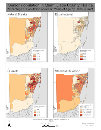
This week's Module (Module 4) dealt with statistics and how to represent statistics on a map in order for them to be accurate and easy to read and understand. The assignment involved producing two maps each map was broken down into 4 distinct maps with each represented a different type of statistical classification system. Natural breaks, equal interval, quantile and standard deviation classification systems were used for both maps. The difference in the maps was the normalization of data. The second layout normalized all classifications by the area (in square miles) of the census tract. After analyzing the results of both maps and each classification system it appears as if the quantile classification system best displays the data provided. In some cases variation within classes was very minimal or very hard to see. On my layout with normalized data I used an inset map to detail the northeastern portion of Miami Dade County. Even with the inset the data is difficult to see. The true issue is that the data does not work well with a standard deviation classification system.
Saturday, April 17, 2021
Subscribe to:
Post Comments (Atom)
GIS 6005 Communicating GIS Final I have reached the final assignment of this course. This week we had to put all the skills that we learned ...

-
This week I worked on the assignment for Module 5. Module 5 had to do with choropleth maps. This assignment was fun but a little challengin...
-
Photo Interpretation and Remote Sensing This week in class we learned about the different factors that could interfere with Electromagnetic...
-
GIS 5050 Week 1 Lab Assignment. This weeks lab assignment was to complete a crude map of the world. Very little data went into the creati...


No comments:
Post a Comment